01 // OVERVIEW
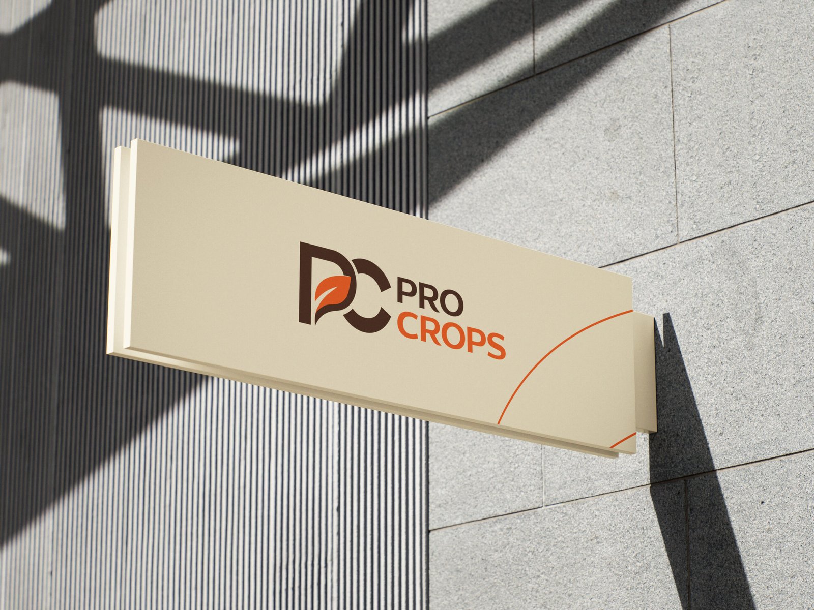
ProCrops is a brand identity project built around a fresh, natural, and modern approach to agriculture. The visual identity combines bold typography, organic elements, and a distinctive color palette to communicate growth, sustainability, and a strong connection to nature.
CHALLENGE

Challenge

ProCrops is an agricultural brand focused on growth, quality, and sustainability. The project involved creating a distinctive visual identity that reflects the brand’s connection to nature, combining modern design with organic elements to establish a strong, recognizable presence across different brand applications.
IDENTITY

Strategy

The strategy focused on positioning ProCrops as a modern, trustworthy agricultural brand. By combining nature-inspired visuals, bold typography, and a consistent color palette, the goal was to create a memorable identity that communicates quality, growth, and a strong connection to the agricultural industry.
APPLICATION

Social Media

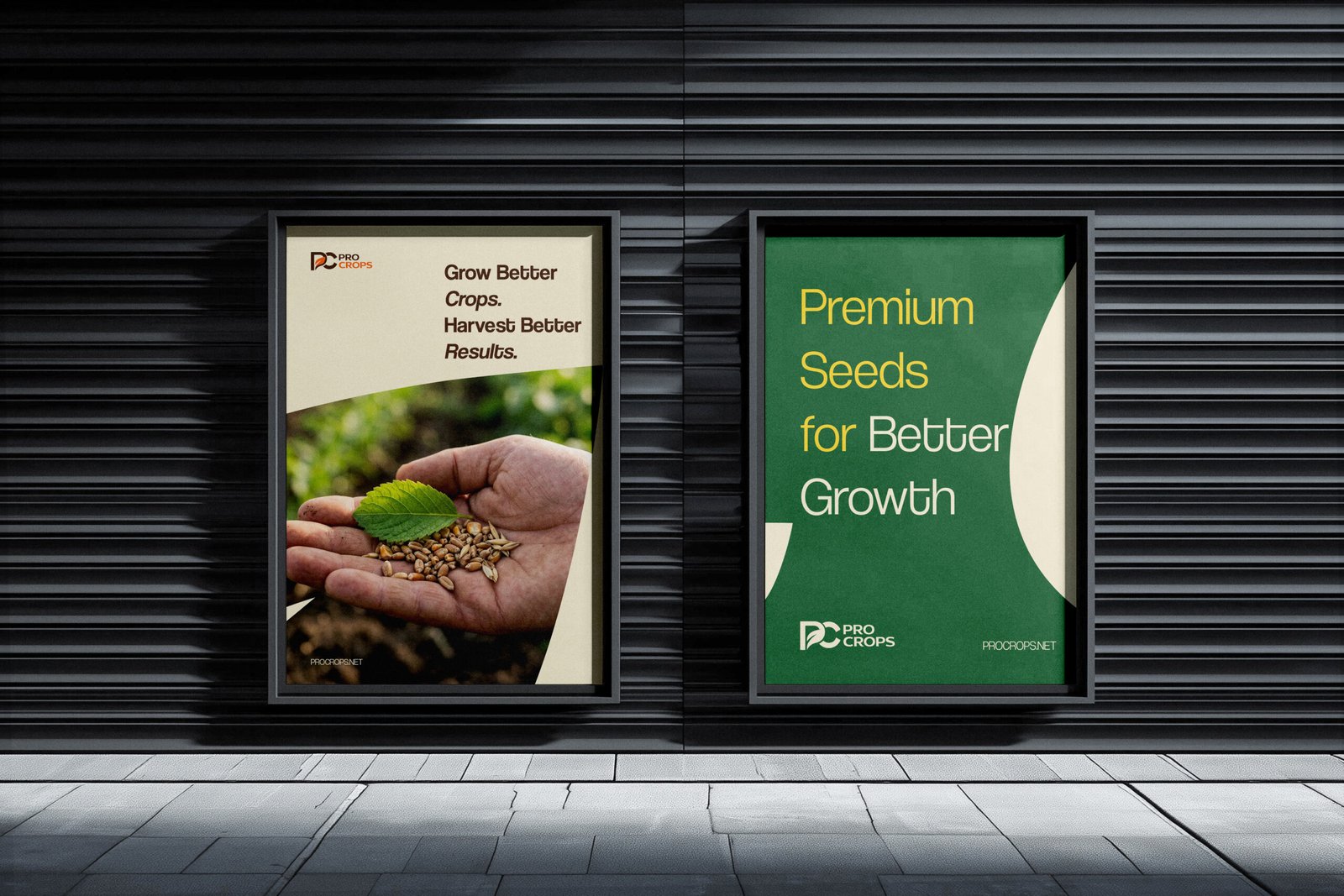
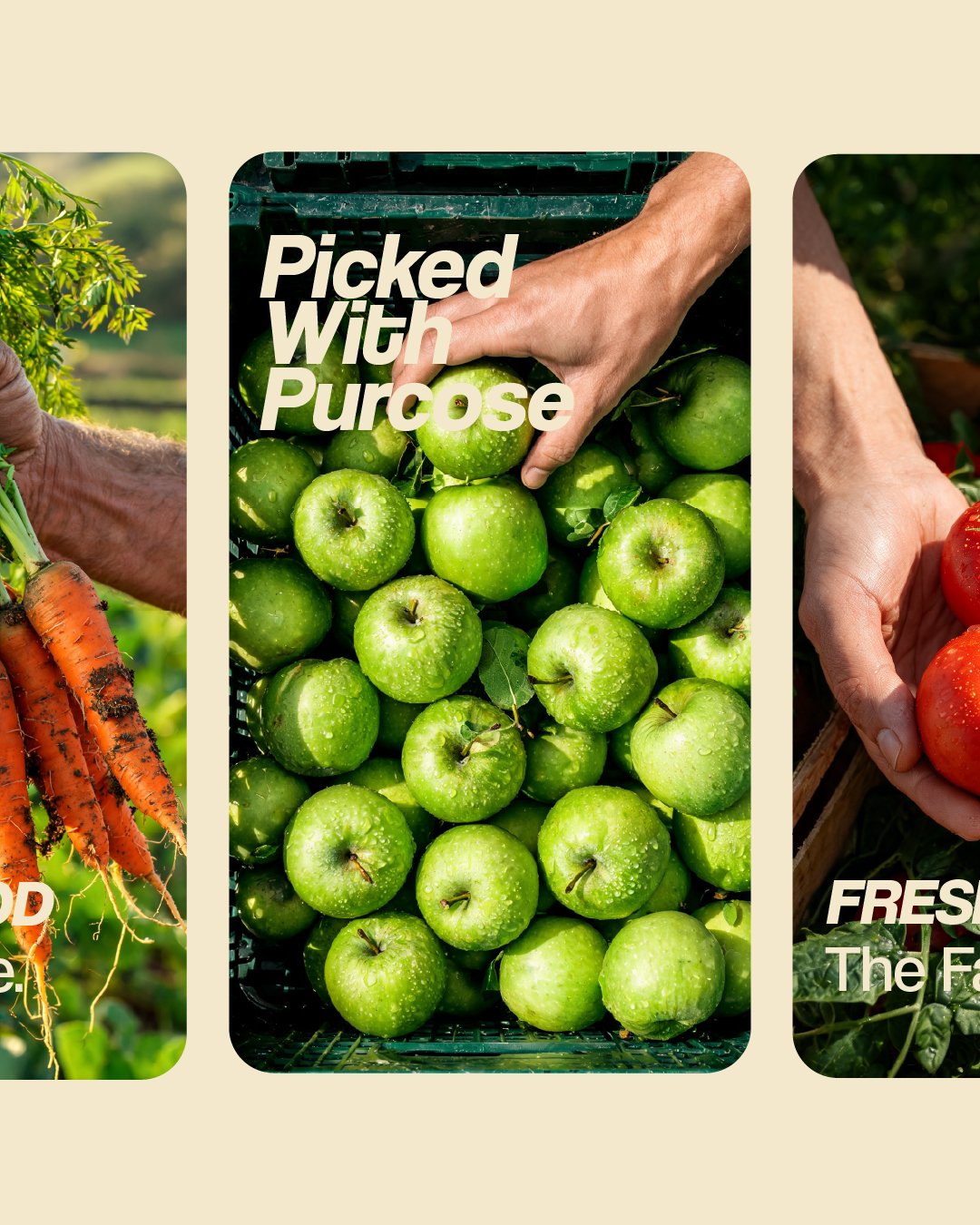
The social media direction focused on bringing ProCrops’ brand identity to life through engaging, visually consistent content. By combining bold layouts, agricultural imagery, and nature-inspired colors, the designs create a strong digital presence while communicating the brand’s values of quality, growth, and sustainability.
RESULT

Application

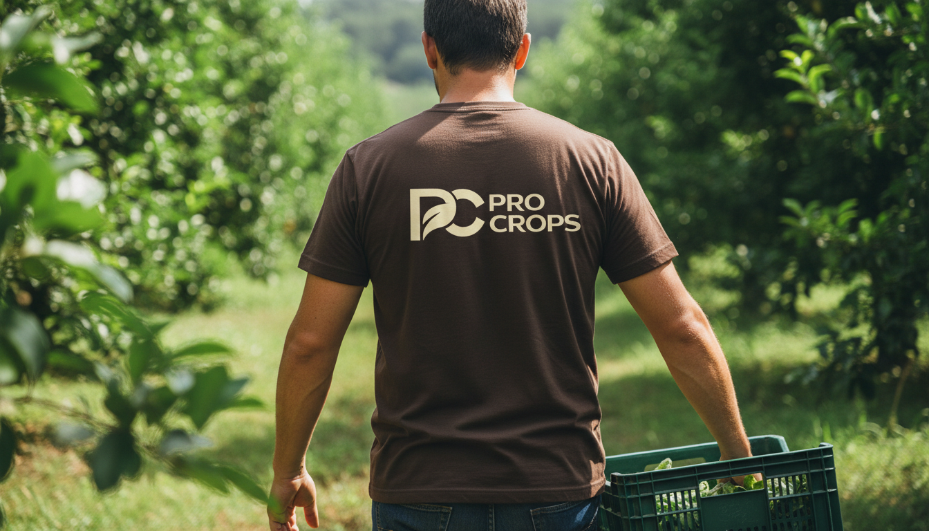
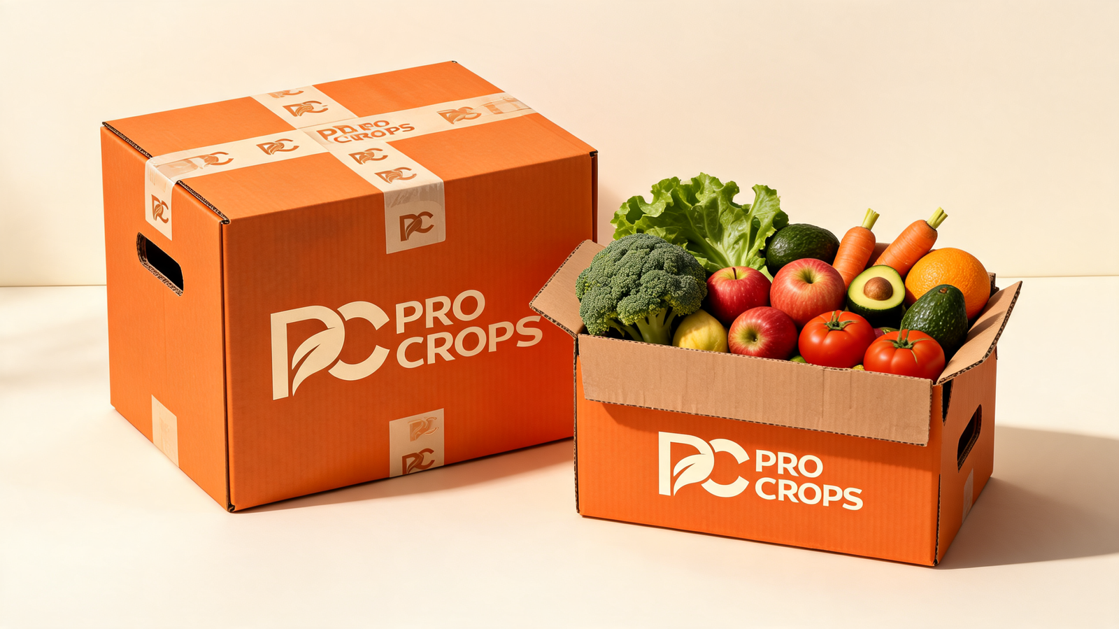
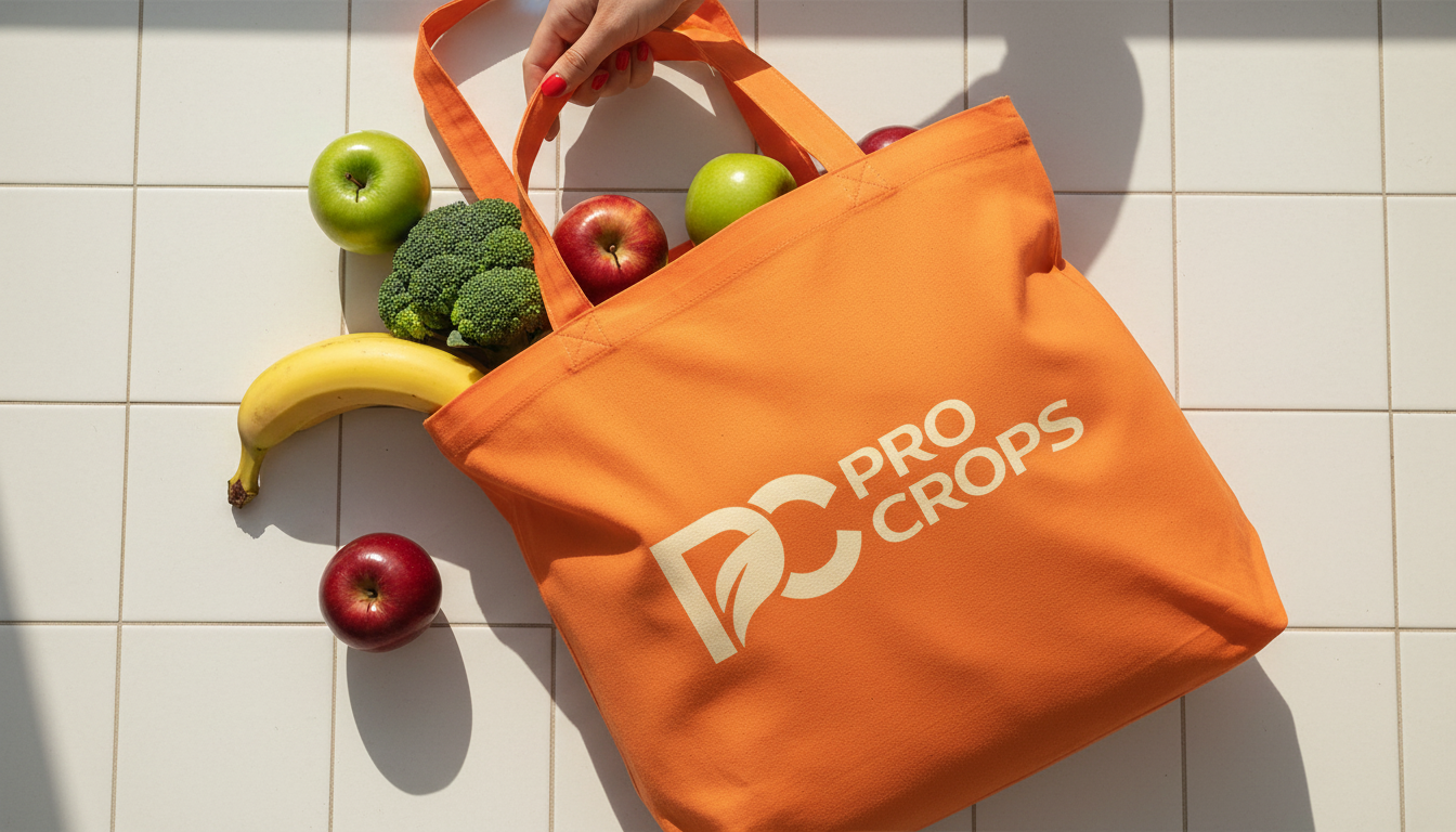
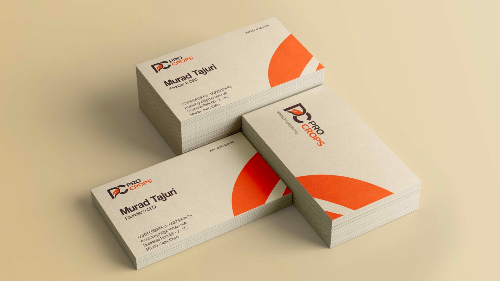
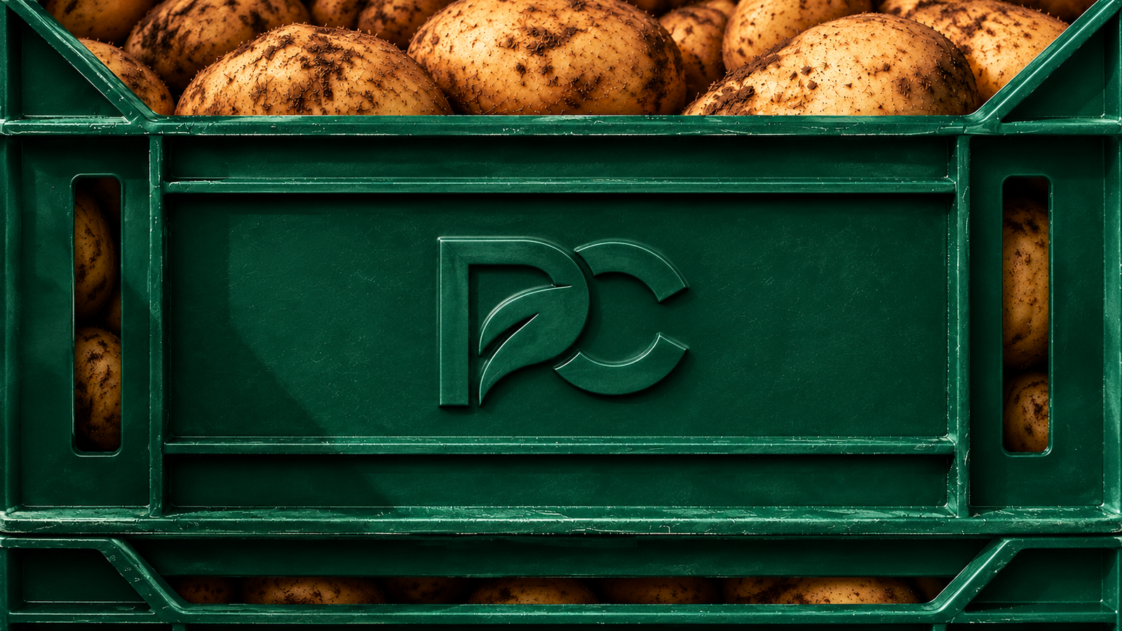
The brand identity was extended across a range of printed materials, including packaging, stationery, and promotional assets. Each application was carefully designed to maintain visual consistency, highlight the ProCrops logo, and create a professional, recognizable brand experience across every physical touchpoint.